Artefacts of Ouranos Covers
How can Black Letter typography be used to effectively redesign the covers of the Artefacts of Ouranos?
Services
Typography,
Book Design,
Illustration
Description
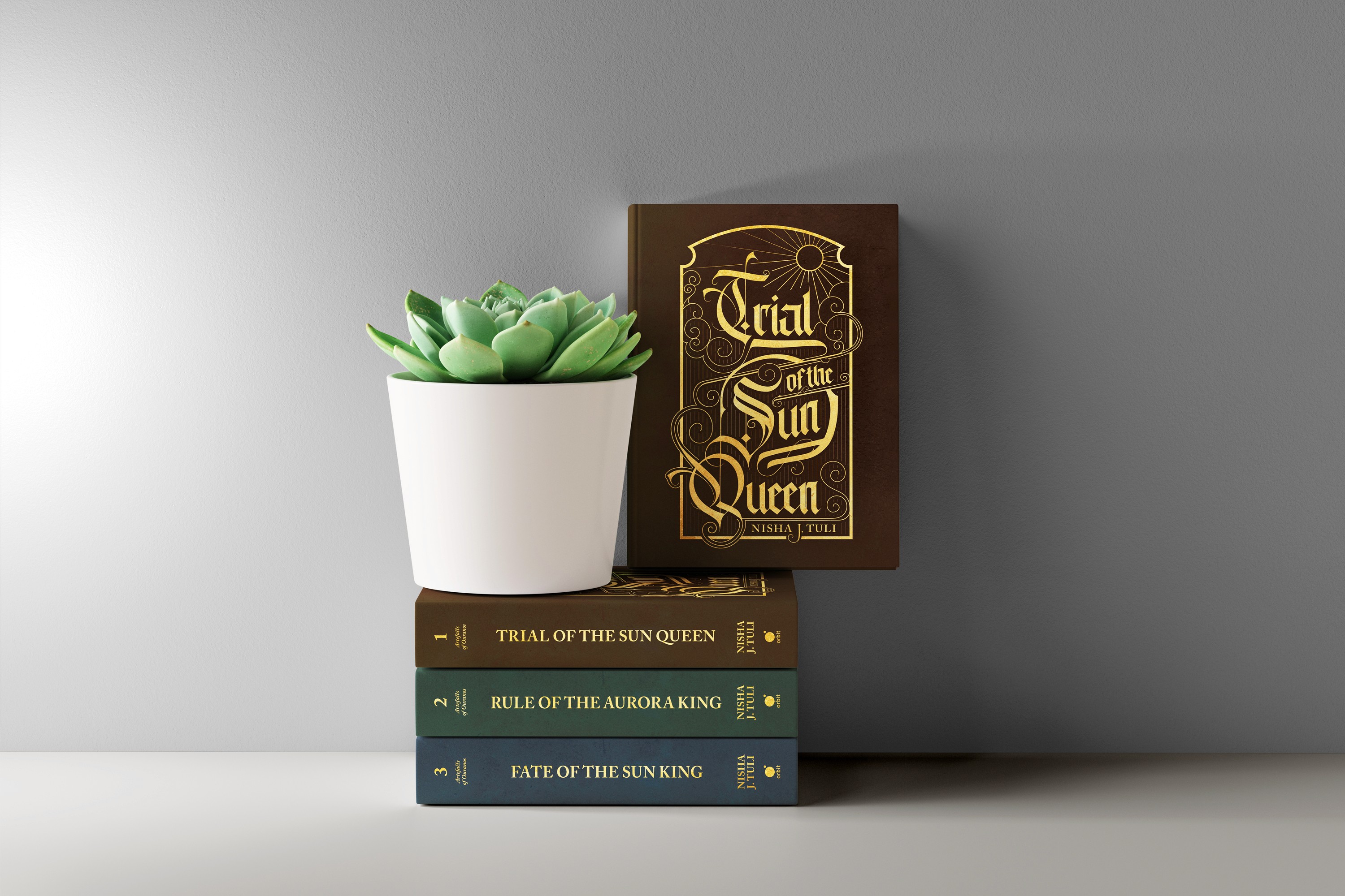
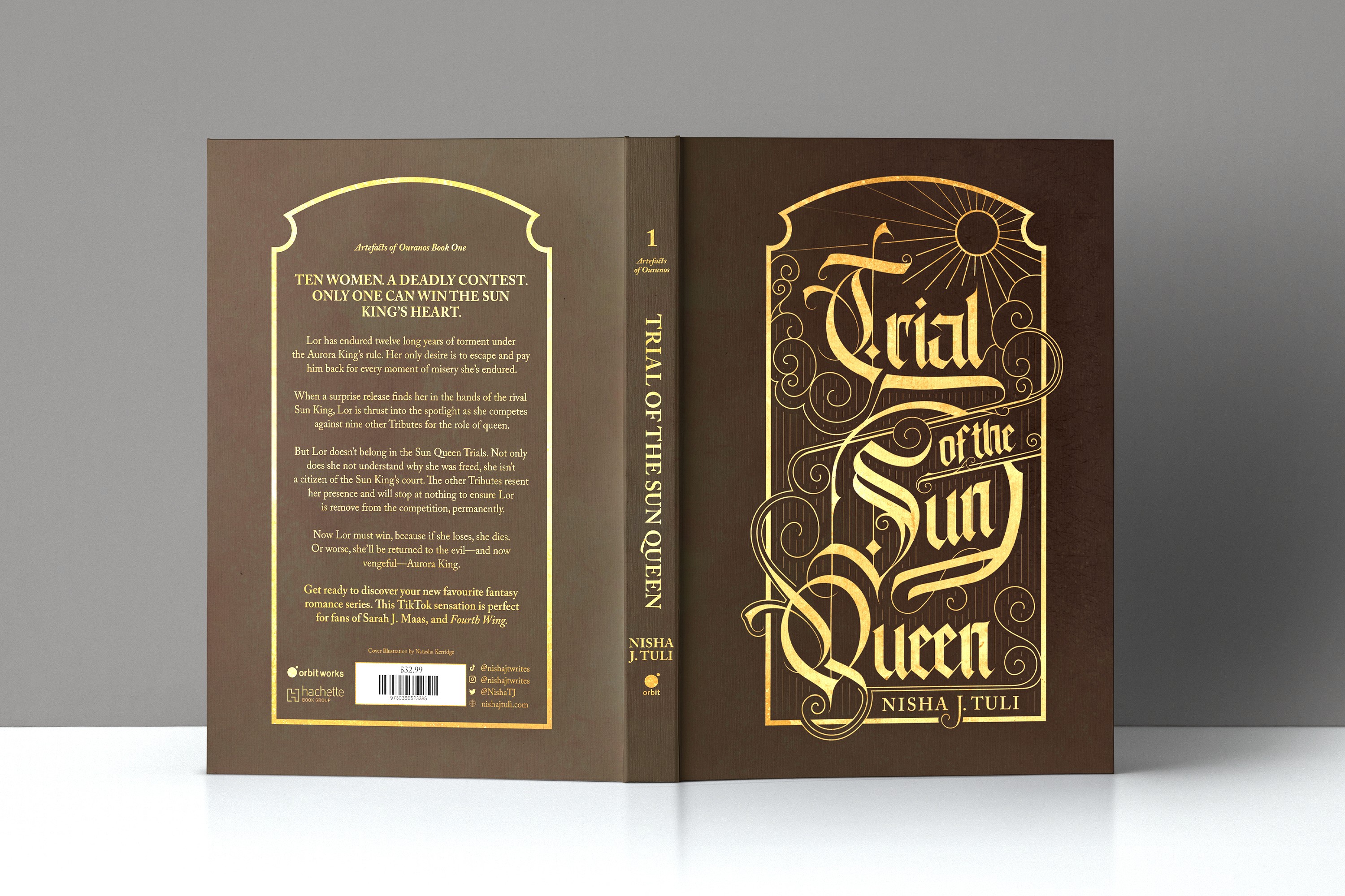
This project focused on redesigning the book covers for the Artefacts of Ouranos series using Black Letter typography, blending traditional type design with elements drawn from the books to create an impactful and cohesive cover.
Research
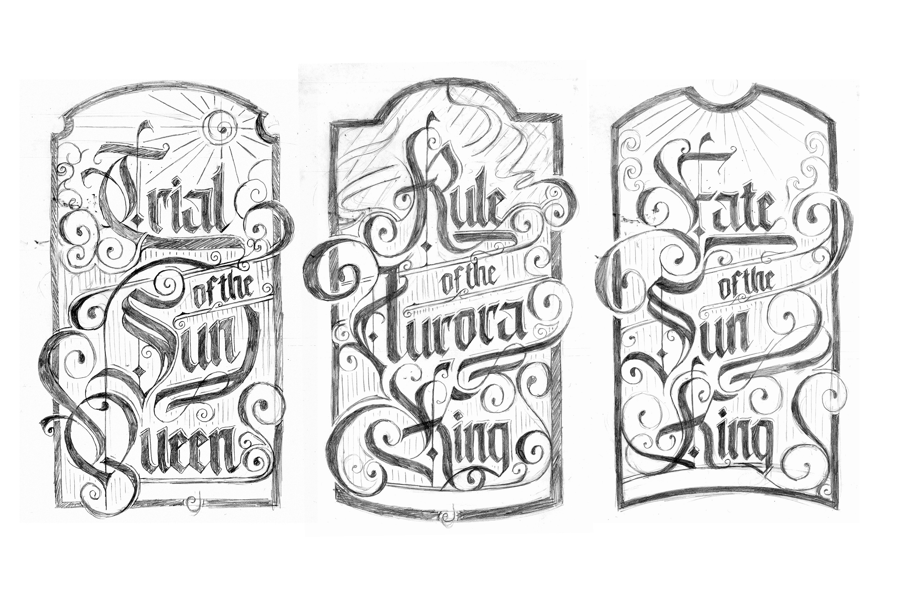
Initially, I conducted an in-depth analysis of Blackletter type, focusing on its structural integrity and the historical context in which it was traditionally used. Blackletter, once hand-drawn, required that element of craftsmanship to be prominent in my design, but it posed a challenge in terms of legibility within a modern context. Much of my research centred on how Blackletter has been adapted in contemporary designs, focusing on readability. Key factors included font size, the complexity of swashes, and the spacing between letters—all crucial elements to consider as I moved into the development phase.
Challenges and Solutions
BLACKLETTER FONT Challenge: Finding a legible Blackletter font that suited the book covers. Solution: Created a custom typeface by combining fonts and adding custom illustrations. BALANCING THE TYPE Challenge: Balancing the intricate Blackletter typography with other cover elements. Solution: Used framing and illustrations to highlight key type features while maintaining design harmony. DIGITAL VS. HAND-DRAWN ELEMENTS Challenge: Blending digital and hand-drawn elements cohesively. Solution: Simplified the design by focusing on a digital style with consistent line widths, allowing the Blackletter type to stand out.